
Continuing my look into the stories behind movie related things we all take for granted, this week’s choice is the 20th Century Fox logo. If you only hear the music it’s something you immediately relate to movies. But what’s the history of the logo?
Before we get to 20th Centruy Fox, we first have to look into it’s history. William Fox founded his company Fox Film Corporation in 1915. It was a merger of two of his companies, a distribution firm called Greater New York Film Rental and a production company called the Fox Office Attractions Company. He concentrated on building theaters, but slowly started making more movies as well. He almost merged the company with MGM, but because of the stock market crash the deal didn’t go through. This didn’t go well for Fox as his company was close to bankruptcy and Fox himself ended up in jail for trying to bribe a judge and committing perjury. He lost control in 1930 and the company merged with the very new 20th Century Pictures in 1935. The logo wasn’t always the same:
Before 1930

Only these words appeared before the start of the movie.
1930
After Fox lost control the title was changed to “Fox Film Corporation presents”.
1933
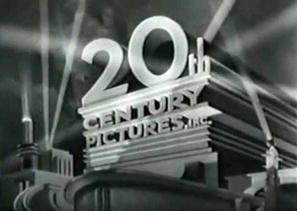
20th Century Pictures had the now famous logo, which was painted by Emil Kosa Jr, who later did a lot of matte paintings for big movies, the most famous one being the Statue of Liberty in Planet of the Apes and his Oscar for the special effects in Cleopatra.
1935
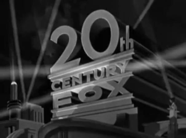
After the merger with Fox, Kosa simply replaced “Pictures” with “Fox”. There was also a three-strip Technicolor version of the logo, which was used for the movie Ramona (1936)
1953-1981
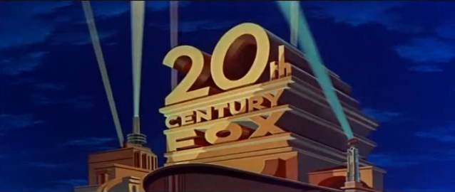
With the introduction of CinemaScope the logo was altered (aslo by Kosa) and was used till 1981. An exception is 1970 and 1971, when no logo was used, just “Twentieth Century-Fox Presents”. This resulted in a lot of criticism and the logo returned.
1981-1993
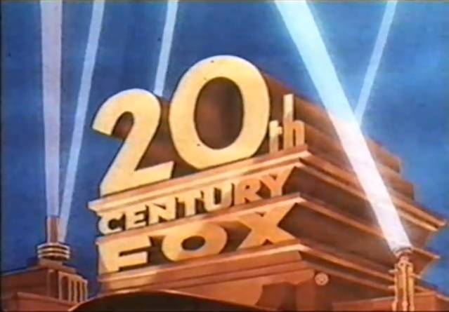
After a new version was done for the opening of Cannonball Run, it was adopted to be used on other movies as well.
1994-2009
[youtube=http://www.youtube.com/watch?v=dgIPOkmhD08]
In 1994 a CGI version was created.
2010
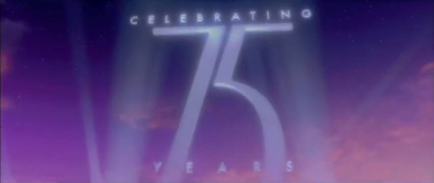
To celebrate their 75 year anniversary the camera panned up after showing the logo and this 75 appeared.
You might also be interested in:


This logo is awesome too 😀 Especially because of the music, you really can’t hear it without thinking about movies!
Thanks a lot, that music is classic!
It’s a classic logo. You hear the music and see that and you instantly know the studio.
It’s interesting to see it hasn’t changed a whole huge deal since the logo we know now was created.
This one really didn’t need much change as gives the feeling you are about to witness a big event.
Awesome love this post! Great bit of history. I wonder if there are there are other films where the logo has been changed just for a specific movie? Like with the snowy version for Edward Scissorhands?
Well, it seems there is website for it and the answer is yes. This has an amazing collection of them: http://www.closinglogos.com/page/Logo+Variations+-+20th+Century+Fox+Film+Corporation
Do you not automatically think of The Simpsons movie when seeing this logo? No? Just me then….
Haha, I think it is just you Scott. Although it now does make me wonder what it looks like for that movie.
Interesting article, at uni I covered film pre-1930s and it seemed like an interesting time in seeing how these companies like Fox, Warner Bros and even RKO came to be and how we see them today. Some things change and some things don’t!
Looking forward to seeing the Universal post, if i’m not mistaken it used to be a muscular man pounding on a gong of some sort?
Yeah, I never looked into the history of these companies, but learning about their history through these logos has been very rewarding. I don’t know about the Universal one, but I’m sure I’ll find out soon. Thanks for commenting!
This is one of my favorite studio logo! Did you know that Randy Newman’s uncle Alfred Newman composed the fanfare? It’s conducted by Leonard Bernstein. I just learned that on NPR the other day: http://www.youtube.com/watch?v=F6Y7JHO4b_8
No, I didn’t read anything about the fanfare, I guess I should have looked into that as well. Thanks for the info Ruth!
Another great post. I think the scope version is my favorite one.
Thanks for reading!
Very interesting read, more of the same please!!
More coming up. This week’s choice will be MGM!
One of the most iconic images in contemporary cinema. I always wondered about the beginnings of the logo but I never took the chance to find out a little more. Very interesting read. Perhaps things would be very different had Fox merged with MGM, starting with the logo, which would have never seen the light of day.
Thanks for dropping by my blog the other day. Very nice one you have going here.
Niels
Nice to share a bit of knowledge and see it being appreciated. I always wondered as well and thought it be interesting for others to read it as well.
Thanks for visiting Niels!
One of the great Hollywood logos. Great journey through history there mate!
Thanks Rodney!
I’ve seen this logo literally hundreds of time but never knew the story behind it. And I call myself a classic movie fan 😉 Thank you for putting this together!
Well, I didn’t know either before writing this, so I’m glad to share the knowledge!
One of the most iconic film production logos. Great write-up as always and loving the series.
Thanks Raghav!
Pingback: The Story Behind… The Columbia Pictures Logo « My Filmviews
Did anyone ever notice the simularity between the logo change made by universal for Smokey and the bandit and the logo used by 20th Century Fox for Cannonball run? both have cartoon Car chases around and through the logos and then have a version of Main Star Burt Reynolds Laughing at the end.
Smokey and the Bandit:
[youtube=http://www.youtube.com/watch?v=F249ib1bzOY&feature=results_main&playnext=1&list=PLC0F55869835062DC]
[youtube=http://www.youtube.com/watch?v=w-_9whWIGvQ&feature=BFa&list=PLC0F55869835062DC&lf=results_main]
Cannonball Run:
I wish there was an Edit Button for this site. To see the Smokey and the Bandit one click on the blue and to see the Cannonball run one click on the embedded video.
Have edited it for you ronald and both videos play now!
hello, great article.
someone knows maybe in which movie this logo take part?
not before the movie but actually in it.
thanks ahead!
You’re missing one of the best variants of it — the “30th Century Fox” logo used at the end of each episode of “Futurama.”
I decided not to look at all the variants, just the main logos which were used. There are sites which do show all of the variants that were done for specific movies.
In 1953 Alfred Newman composed the ‘CinemaScope Extension’ to allow for the addition of the ‘advertisement’ of the new screen process, shown after a dissolve. I think that the grandeur of the full fanfare and Kosa’s brilliant reworking of the high-rise logo in the CinemaScope years make for the most awe-inspiring version of the logo. It’s very stately, and the ‘architecture’ of the logo is more distant than the more intimate earlier view, which adds to its majesty. The brass in the fanfare sounds as epic as you can get. It all makes me want to bow down in homage – even though Doris Day in ‘Caprice’ might follow!
(Paramount of course followed the trend with their magnificent VistaVision opening, with its smashing fanfare by Nathan Van Cleave.)
I think that the current 20th-Fox CGI version, with the full fanfare sensibly restored (conducted by Alfred’s son David) is of course impressive, but just a little too ‘perfect’, and kind of pretentious. Plus, the ’20’ isn’t rendered nearly as well as in Kosa’s version. David Newman is a wonderful composer, but his version just doesn’t have his dad’s unique ‘sound’ to it.
The most powerful (and haunting) non-fanfare (and non-CinemaScope) 20th-Fox opening, in my opinion: ‘The Sand Pebbles’, with Jerry Goldsmith’s score starting to build. Incredible effect. And for ‘Cleopatra’, filmed in Todd-AO, there’s no CinemaScope extension, and no fanfare, though Alex North’s intriguing arpeggio makes for a unique introduction to a tremendous picture.
Thanks for your insights!
I Have To Know That Disney Is Good.
Ok, do not know how to respond to that…
Im scared of 20th centry of fox because the starting noise creapes me out and gives me nightmares. i bet in the movie Mr. Pebody and Sherman the scenes starts old fasion and goes to the 2014 vershon because of time travel. It will creap me out more because I never saw the movie and i do not know what going to happen
one time I looked at funny 20th centry of fox somebody cropped Benson (from cartoon networks Regular Show). His gumball machine face was cropped on the 0 for 20th. Prety funny. HE HE HE!!!!!!!!!!!!!!!!!!!!!!!!!!!!!!!!!!!!!!!!!!
20th centry of fox is bad
WHY people use my name too many times?
I like the article
this is amazing
du¿¿¿¿¿¿¿¿¿¿¿¿¿¿¿¿¿¿?????????????????????????????????????????????????????????????????????????????????????????????¿?????????????????????????????????????????????????????????????????????????????????????????????????????????????????????????????????????????????????????????????????????????¿¿¿¿¿¿¿¿¿¿¿¿¿¿¿¿¿¿¿??????????????
I WILL CLICK MY WATCH AND TURN INTO A ALIEN. THAT WAY I COULD EAT THE LOGO.
DUDE, what we should do to this logo?
I don’t know?
so did i.
Help me finn and jake. Ice King is destroying the candy kingdom.
GO TO WORK OR YOUR FIRED! AND MORDECI AND RIGBY SHOULD STOP SAYING IM A GUMBALL MACHINE!
die ice king die
this site is wonderfull. I WILL STILL CAPTURE PRINCESS BUBLEGUM!!!!!!!!!!!!!!!!!!!!!!!!!!!!!!!!!!!!!!!!!!!!!!!!!!!!!!!!!!!!!!!!!!!!!!!!!!!!!!!!!!!!!!!!!!!!!!!
kill benson because he is a idiot
SHUT UP MARCILINE! He is our boss. I DARE YOU TO WACH A 20TH CENTRY OF FOX MOVIE IN FRONT OF ICE KING
MACILENE should shut herself up
YA!!!!!!!!!!!!!!!!!!!!!!!!!!!!!!!!!!!!!!!!!
I’m going to go to hollywood to see the structure
MOM! GUMBALL AND DARWIN ARE ON THE INTERNET
I enjoyed your article. It cleared up a few things I had been wondering about the evolution of the 20th Century Fox logo. One comment though… You mentioned the camera “panning up” in reference to the 2010 logo. A pan is a horizontal camera movement. You cannot pan up. The phrase you’re looking for is “tilting up”.
This is a very and fine interesting 20th Century Fox logo there! And it’s 80 years old this year(1935-2015)and it will continue to put more and exciting and interesting movies(and TV shows as well)the most interesting logo in the world!
l love 2009 20th century fox
This is a cool logo. I pray to Yahweh (God) that Disney does NOT buy this logo because it would never be the same again once they do.
Pingback: A Century of Film: 20th Century-Fox | News from the San Diego Becks
FYI | As a Fox veteran, I can tell you that on the Fox lot it’s not referred to as a logo, but as “the monument.” The current iteration of its theme music was commissioned by Barry Diller when he became CEO in 1984.
I read somewhere in YouTube’s comments regarding the 20th Century monument, as you put it, was believed to be an actual physical construct where tourists might go up and get a picture of themselves by the monument.