It’s been a while since I did one of these, but “The Story Behind…” series is back, this time featuring United Artists. I really never thought about the name of the company, but if you read about its history it becomes very clear. The company was formed by Charlie Chaplin, Douglas Fairbanks, Mary Pickford and D. W. Griffith and lawyer William Gibbs McAdoo, who all had a 20% stake. As the studio system was forming these actors wanted more freedom and this was the way to get it. Although they managed to set up the company it had some tough times and during the fifties two lawyers-turned-producers Robert Benjamin and Arthur Krim took over United Artists. Its logo has also changed a lot during the years the company has been in existence.
1919-1967
The first logo that was used by United Artists was quite simple as it had the words United Artists shown inside a hexagon. Sometimes the colors were different, but overall it was the same for a long time.
1967-1968
Now this logo is very different from the original and a lot more colorful. The words “A Transamerica corporation” have been added as the control of the company had been sold to this insurance company.
1969-1975
This logo starts out with the blue lines appearing, moving backward and forming the T! The the rest of the text appears.
1975-1976
This logo shows lights slowly switching on after which United Artists appears in gold with some highlights.
1975-1982
This logo is similar to a previous one. This one starts out with United Artists, after which the “T” appears together with “A Transamerica Company”. A later version only showed United Artists as the company was sold by Transamerica to MGM.
1982-1987
This redesigned logo starts with a blue line which slowly starts turning revealing a stylised “UA” after which United Artists appears below.
1987-1994
The logo also has a stylised “UA”, which is crossed by some light creating the points in the A.
1994-2000
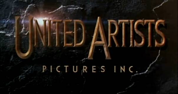
A lot of star shaped lights appear, slowly showing United Artist on a background made out of marble.
2000-2001
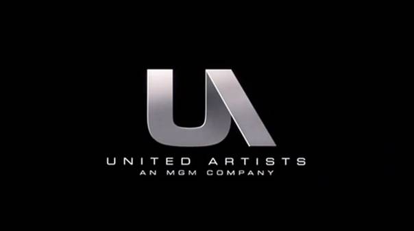
A throwback to a previous logo, it again shows the stylised “UA”.
2001-

Almost the same as the 2000-2001 logo, but the swoosh from a previous logo also appears here.



I’m not sure what it is about these posts, but I’ve happened to catch several of them just looking at the recent movie related blogs on WordPress and I always find them interesting.
Thanks! What’s the way you search for them?
I just use the topics on the main WordPress page and take a look at all the recent blogs tagged Movies. I’ve just happened to catch like 3 or 4 of these posts within a couple hours of when they were posted.
I never used that option, but looks like something useful. Thanks for pointing it out!
Love that 94-2000 one.
Yeah, it’s probably my favorite as it is the first one I think of when I think of United Artists….
This is one of my least fave but still interesting to see its history.
Can’t like them all 😉
The UA logo always reminds me of the original Pink Panther cartoons they produced.
Pingback: Sources | Behind the Vault Doors
United Artists owned a stake in the James Bond movies; Harry Saltzman sold his share to UA in the mid-1970s, as Mr. Saltzman was having financial difficulties. Ironically, the recent Bond flicks have disposed of the UA logo, and just use the MGM lion logo. (The Daniel Craig “Bond” flicks also have the Columbia logo, as Columbia is a partner in making them.)
Transamerica sold UA to MGM in 1981, as a consequence of the monumental failure of “Heaven’s Gate”.